Of Design and Destiny

Must modern cities be ugly? Of course not, and they are not. But I walk past this “Skypark” thing quite often and it’s horrible. I mean, look at it.
It stores a few hundred teleworkers between 8am and 8pm, which is an act of evil in itself, but must it look like one? I’m only a passerby — I don’t deserve to be insulted.
“Know your place,” that building says, “You’re a cog in a machine in a grey, grey world.”
I like to wear a colourful pocket square when I know I’m due to pass it. It’s on a street corner with a lot of traffic, so I sometimes play with my yo-yo while waiting to cross.
“Such frivolousness,” the building says, “Earn your pittance! The grave is your destiny, so get trudging!”
Everyone likes the idea of beauty but we’re increaingly turning our backs on it because of some vague notion about the importance of professionalism and seriousness. To be beautiful is to be eccentric or profligate.
Design today must apparently be hard-edged, sober, practical, sturdy, and — while actually very expensive — look cheap. That, or it can be beautiful and temporary and safely stashed in a museum where nobody will see it.
To add a little flourish or some colour or nuance — or even to spell something properly — is seen as increasingly anachronistic.
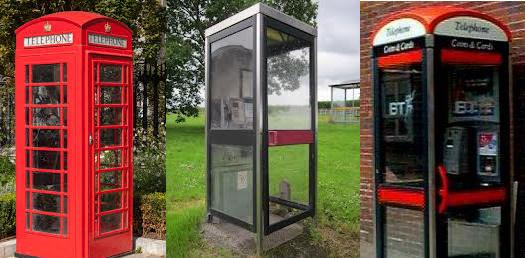
I’m always cheered to see a red telephone kiosk. It’s a design classic, it works, it’s an internationally-adored symbol of Britain. It’s cheap to use, it’s practically indestructible, and it can be trusted to deliver. Most of us would love to have one on our street corner, but we can’t apparently.
BT started getting rid of the red telephone box in about 1985, planting those horrible black perspex ones instead. You just know this was the result of a meeting in which some influential philistine said “the classic red telephone box does not reflect BT’s corporate values.”
The new kiosks said everything about municipal mediocrity. “Don’t go thinking you’re part of an empire,” it said, “don’t go thinking you’ve got better things to do than go to school and get a job and die.”
I mean, look at that one in the middle. They were routinely vadalised but how could they not be? I’d love to smash that one in. It’s practically what they’re for. In response to this public disdain and an outspoken nostalgia for the classic red box, BT brought out a happy medium which looked a bit like the shitty modern ones but with a domed top reminiscent of the classic.
The message was “Yes, everyone likes the classic… but we can’t have it because of the way the world is going. Nobody likes the modern version, but we have to have it this way. Haven’t you heard of inevitable decline? You have to work pretty hard to fulfill a thing like that.”
I once visited the Central Public Library in Seattle — a great building designed by Rem Koolhaas — and saw many beautifully-bound books inside. A one-time librarian, I knew the story of these books just by looking at them. The library once had its own bindery in which many old books were carefully rebound to extend their lives. Beautiful materials were chosen to bind the books so they’d be pleasing to the eye. The bindery was closed circa 2002 “because that’s not how things are done today”.
The present day is about Kobo and iPads, not beautiful, free-to-borrow books no matter how much we like the idea and how much sense it makes. Imagine a world in which people carried these books around the city instead of e-readers. It would be beautiful but we can’t have it because of an imaginary landscape called “the way the world is now.”
It’s a destructive logic causing good ideas to be stifled at birth or else scrapped after decades of flawless service. All because of cultural pessimism. It’s as if our national and international misery is seeping upwards into our design.
The implication is that we live in a time of austerity, utility, uniformity, corporate values, plasticity, disposability. Our period cannot be allowed to be one of domesticity, prettiness, happiness, dignity, peace, quiet or luxury.
The idea is that everything is doomed. It suggests there’s no alternative, that ugliness is inevitable, and that the destiny of all material — including human brainstuff — is to contribute to this harsh and sober vision.
But it’s not destiny. It’s all unnecessary. Britain and America are among the richest countries in the world. We’re producing more artists and designers than ever before. The world doesn’t need to be about the bottom line. Bladerunner was a warning, not a blueprint, yet look at the state of the London skyline: symbolic of little but graceless corporate guzzling. “Skypark,” meanwhile, sounds like something from Terminator 2: Judgement Day, a world where robots are in charge and love is on the scrap heap.
It doesn’t have to be this way, my pretties. Design your own lives. Act, move, earn, and speak beautifully. The others will join in sooner or later. Act as if you lived in the early days of a more beautiful world.
About Robert Wringham
Robert Wringham is the editor of New Escapologist. He also writes books and articles. Read more at wringham.co.uk


Your point is a good one. The last part of the 20th Centruy departed from the ‘elegant utility’ of Midcentury modern and saw a hard shift toward ‘utility.’ Or maybe even austere utility.
Whatever you want to call it, it was a shift for the worse. There has been a blow-back of sorts. Architecture has swung back toward the aesthetically pleasing side of the spectrum (although how pleasing it is is certainly debatable).
What you’re talking about here, though–beauty for the sake for the sake of beauty–or even ‘iconic beauty–is still vanishingly rare.
Maybe it still exists in fashion? Home Decor? If you find it, let us know.
This is why, when walking the High Street of my city, I always look up. At eye level there are the shop fronts, indentikit glass-fronted global brands. On the first or second floors there are the facades of the buildings built many years ago. The designs are astonishing and detailed. One says “Electric Theatre” and was an early cinema. Another has a coloured glass mural. There is so much up there which is extravagant and exotic, simply there because it looks pleasing, in stark contrast to that below which is simply there to sell and advertise.
When asked why he thought America was such a violent society, Oscar Wilde replied it was “because you have such ugly wallpaper”. He understood that an ugly environment breeds ugly ideas and ugly souls.
Thanks Robert for a great little piece. It’s caught me in an already cracking mood, drinking my favourite wine while waiting for the slow-cooked lamb to be ready, listening to Neil Young, back from drinking a local pint at the local, with no Monday-morning alarm set.
Unlike you I’m a country man and get my aesthetics every day walking and biking an old railway line through the woods between villages. It also serves as my (the squeamish should look away now) commute to work. Happily my three days a week is about to turn to zero and the future is looking rosy. Round here anyway it does seem to be the earlier days of a beautiful world. And this weekend I had decent conversations with the village butcher, greengrocer, librarian (they have Escape Everything) and publican. Life is indeed happy, quiet and peaceful.
Have fun.
Frugal Surfer
This is the nicest comment in the world! Very encouraging. Cheers to you, Frugal.
Good point about looking up. I just wish it didn’t feel like archaeology though and that things below the second floor could be made beautiful too. I very much agree with your sentiment though. There’s a book called Look Up Glasgow about the city I live in, completely dedicated to rooftop masonry and the likes.
Hi Joe. I like your blog! As to home decor, I’m furnishing a home now for the first time as it happens. Must confess that everything I’m buying is either vintage or, where new, designed to evoke the mid-century. Beauty’s there but it all seems to look back instead of forward. Of course, this may not objectively be the case.
Hey again Mark. Looks like the same chap also did a London version of said book.
Thanks Robert. Sorry, meant to acknowledge this a while ago. I will definitely check these books out.
They’re mostly photographs and there’s probably better photography out there but the idea is neat.